Specializing in Traditional Japanese Martial Arts, Philip offers very specific training services in Chattanooga, TN. Since my knowledge of martial arts consists of watching the Karate Kid movies back in the 80s, I had to do a crash course on YouTube to become more familiar with the different styles of training.
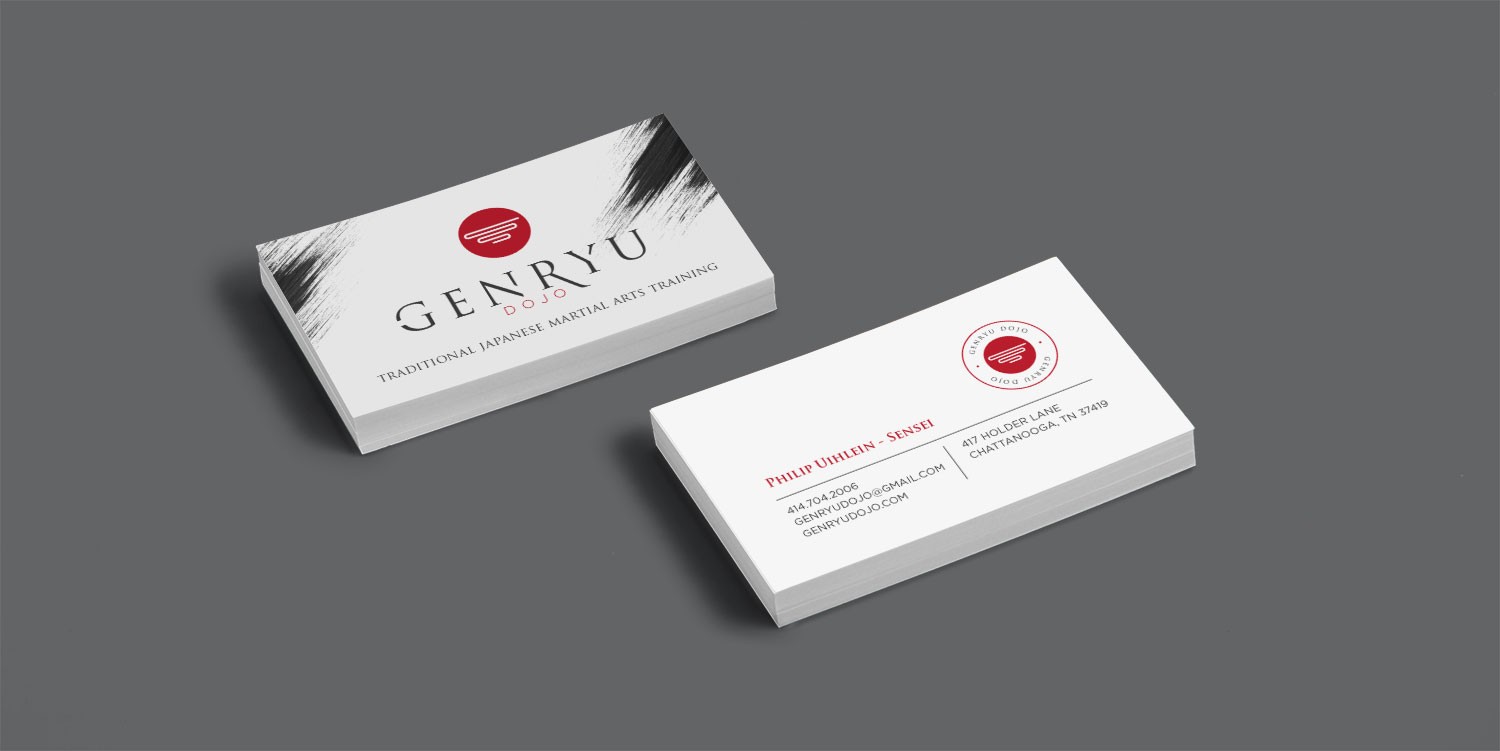
Philip specifically wanted to use black to reflect the attire of Ninjas with white and red as accent colors.
After nailing down the color and style, I continued on with developing logo concepts. “Genryu” means “Source of the River,” so I worked to create an icon that would represent the symbol of a river, the fluid movements of martial arts, while also communicating organization and structure.
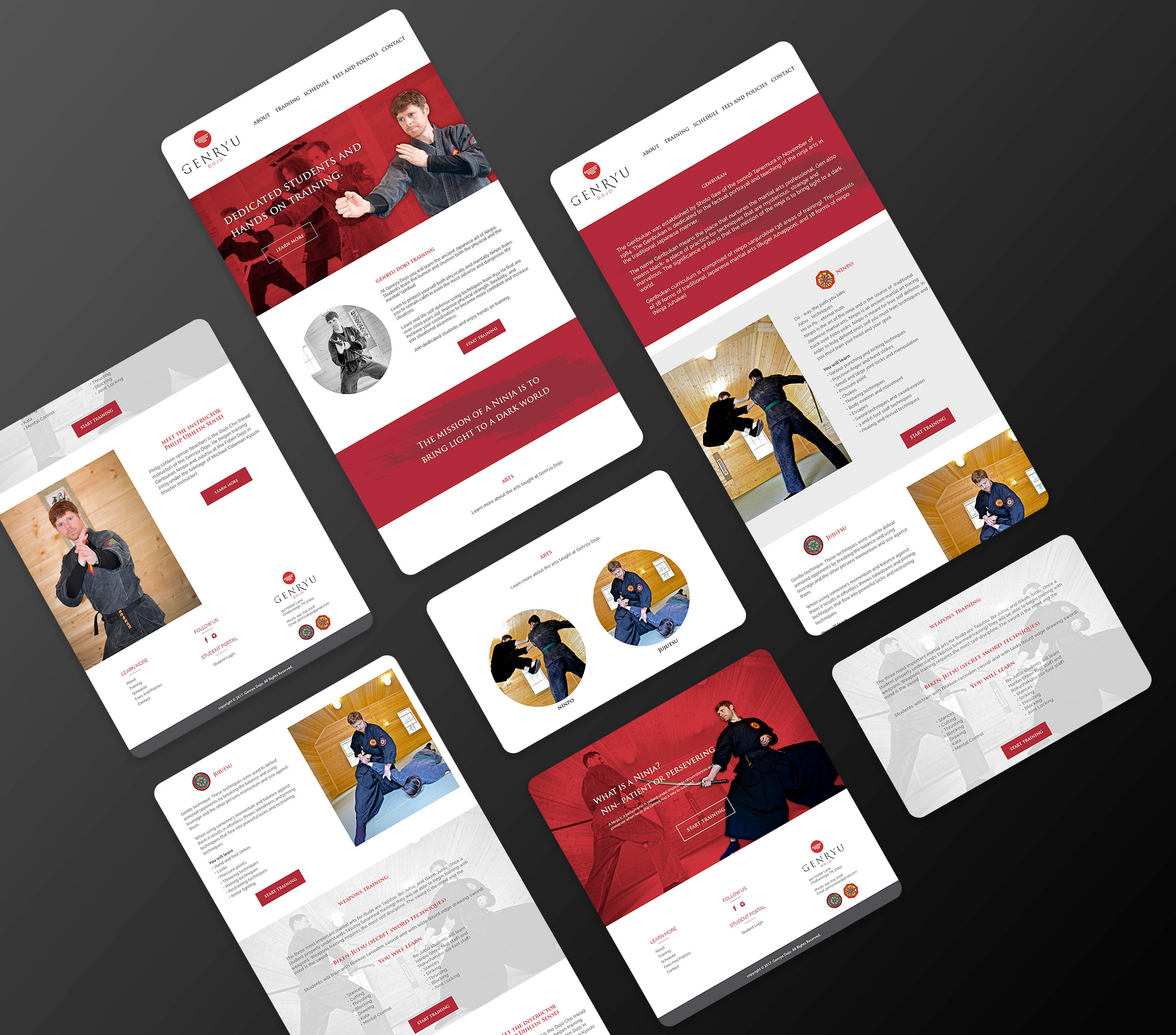
We then moved on to the website. I wanted to create a design that emphasized movement while maintaining clean lines, and repeated the established brand colors.